RETAIL
Retail is experiential, it is immersive and should feel like a world of possibility you can buy a slice of. With that notion of the potentiality, fantasy, comes the reality of the world in which we take our architectural expertise, creating the real from the unimaginable.
A collaborative mindset and the bravery to move forward with courageous design is at the core of all of our client partnerships. While we often talk about evolution in our work, in the case of retail design, evolution becomes revolution. With both a new or established brand, our creative implementation is fluid, swift and strategic. “When we undertake hospitality, commercial or residential work, we will first and foremost develop the iconography of the brand through the design elements, as reflected in all of our work – the Core Club, the Hyatt Times Square, the Gotham residences or LA Metropolis Towers.”
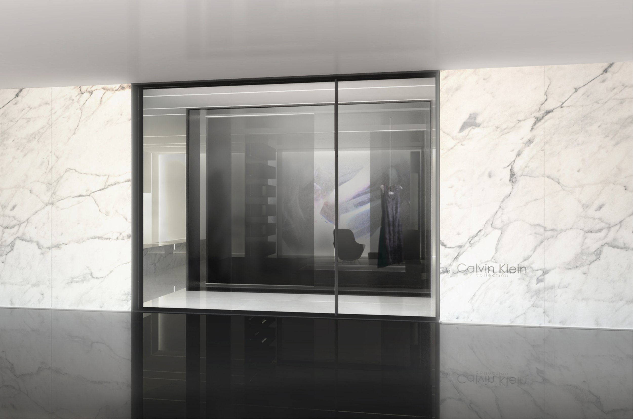
In 2012 we were asked to be part of a design competition to evolve the Calvin Klein Collection brand. SPAN had completed the only CK Collection Boutique outside of NYC in Highland Park, Dallas, and had been working thereafter directly for Mr. Klein himself on his own residence. We’d developed an excellent relationship with the CK in-house design team and for the first time since their inception, they wanted to evolve their physical presence from the initial inspirited aesthetic.
We began our concept design with a reverence for the original architectural intents of the collection stores. That architecture expressed a luxury that was at once discreet and sensual. Calvin Klein has developed a serene and prismatic vocabulary of signature elements: niches, case goods, lighting that are immediately identifiable with the brand. We recognized that you did not happen upon these boutiques; you walk through a door to a destination, a world of ingenuity that you visit with anticipation every season, every new year.
“Uncluttered, sophisticated and curated, the evolution of the new CK stores signaled a new era for the brand, finished with an exterior marble façade; nuanced and compelling luxury was born.”
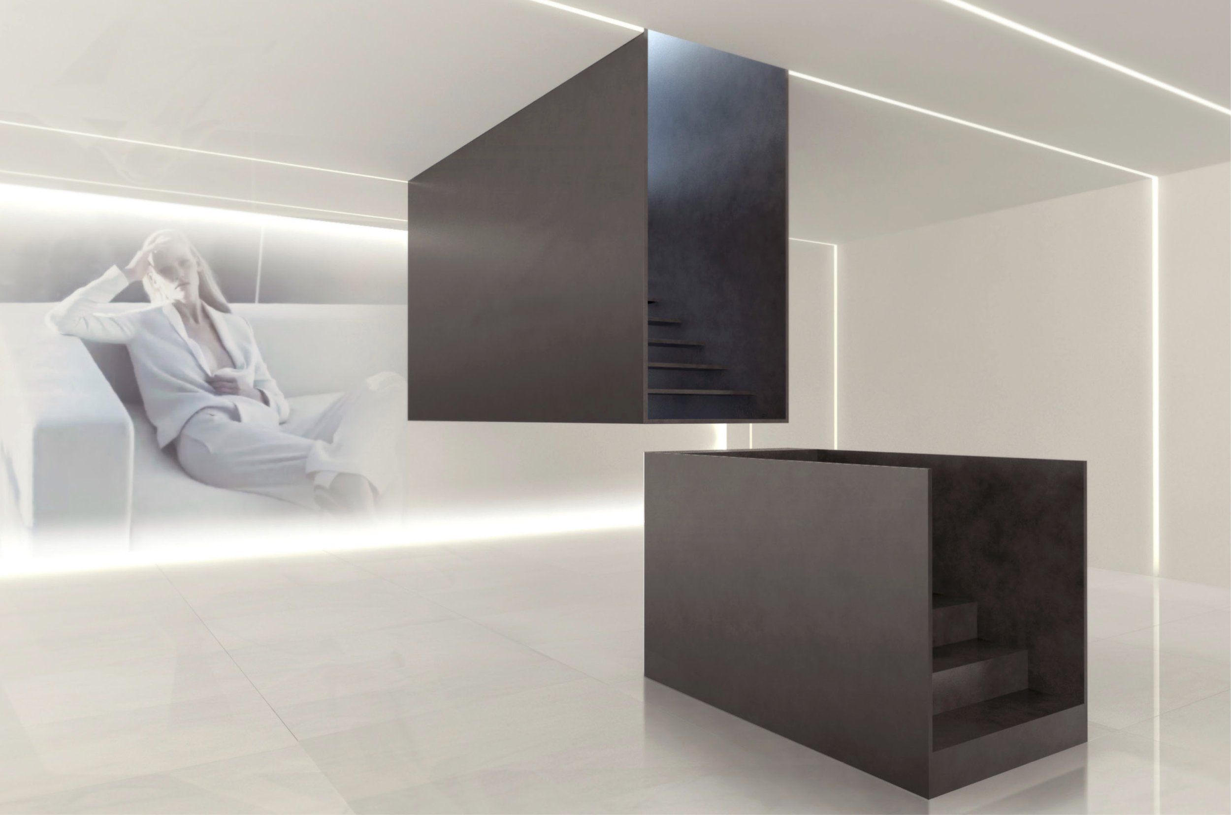
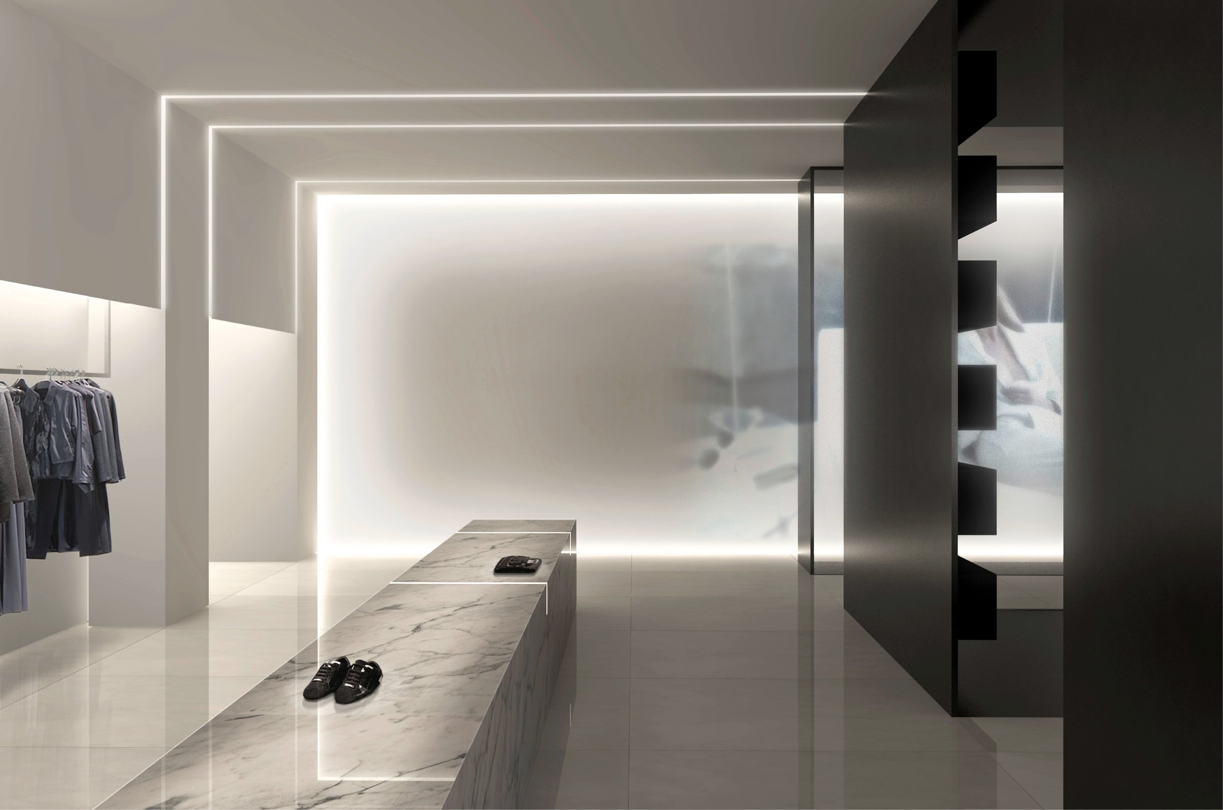
This language further evolved in a two-fold design strategy that blended the iconic with the future of retail experience. A salon, a take on the 16th Century Italian invention, was embedded into the concept store, a curated space architecturally formed by a blackened steel box made up of many frames or ringed ribs placed within the pristine white retail space.
The blackened interior is populated with an almost residentially scaled series of scrims, fixtures and furniture shapes that invite close inspection of the items displayed. New elements, such as monolithically lit objects were introduced. This new lighting concept elevates, filters customers and highlights the sharp beauty of the space and the pieces within.
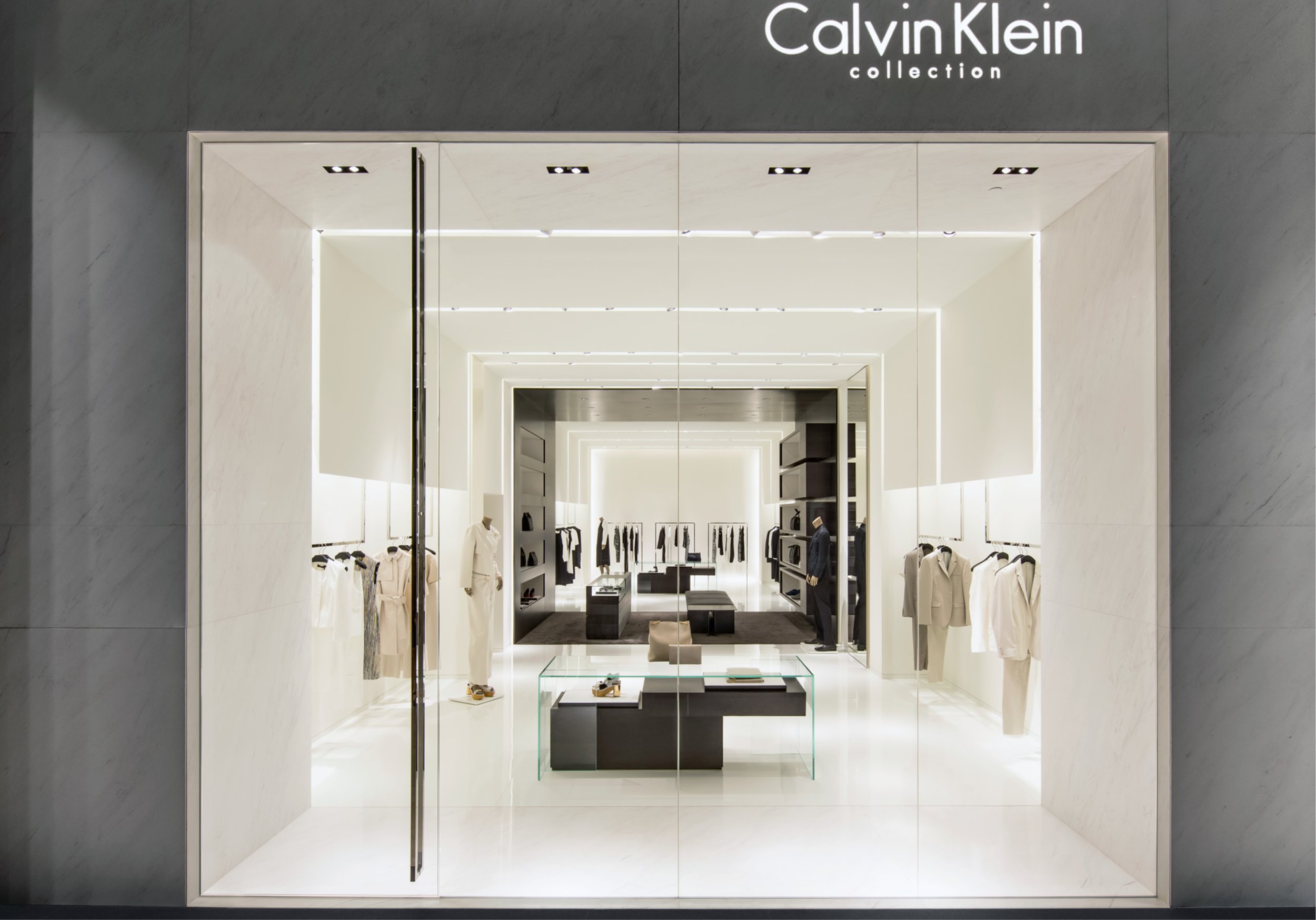
After a successful debut in Shenyang and wining a AIA NYS Citation for Commercial: Small Project, the concept was rolled out to Kowloon/Hong Kong, Shanghai, Singapore, Bangkok, Kuala Lumpur and Macau.
Below, CK Collection Shenyang.
Below, CK Collection Singapore, Bangkok, Macau
In the quest to evolve the architectural persona of other brands, SPAN has worked with many retailers – from Tiffany’s to Frame Denim, Wednesday, Frette, Bally’s, David Yurman, and Pringle of Scotland. Recognizing the best of what signifies a brand, distilling those qualities into their essence and understanding those qualities that have evolved in the product in order to deliver it into the physical space, the architecture becomes essential to the greater experience of the brand.
Fashion is always commodifying street art, music, furniture. We reach into other disciplines to find allied arts that have the same aesthetics – we look to artistic endeavors that have the same value system as your brand. As with haute couture, we bring it in and we tune it up. If Calvin Klein is associated with minimalist art, Pringle of Scotland is associated with the fine art of “hooking” – knitwear and clothing embodying new textures, patterns and material contrasts. Below, Pringle of Scotland re-envisioned.
Frame Denim became an exploration in fixturing. At the heart of the retail experience is the connection of what you are selling and how it is displayed. More often than not there is a reduction of elements, notions that are art world inspired in the works of Sandback, Turrell, Judd or Sera. For their buyers rooms we focused on the art of the table, moving away from a common hang rod to the a beautifully folded object that is displayed on a horizontal surface.
We work with many brands in their genesis, their launch period, as a design collaborator. The initial retail space and offices for GOSmile, the first tooth whitening product of its kind, was inspired by the product and it’s packaging. One entity, the inseparable relationship of the packaging being a holder, instructions and display, translated directly to the architectural interior.
“But what really sets GOSmile apart is that we belive the experience is as important as the technology. We make technologically advanced, highly effective products that make teeth whitening feel more like a luxurious beauty treatment than an oral chore.” GOSmile Aesthetics
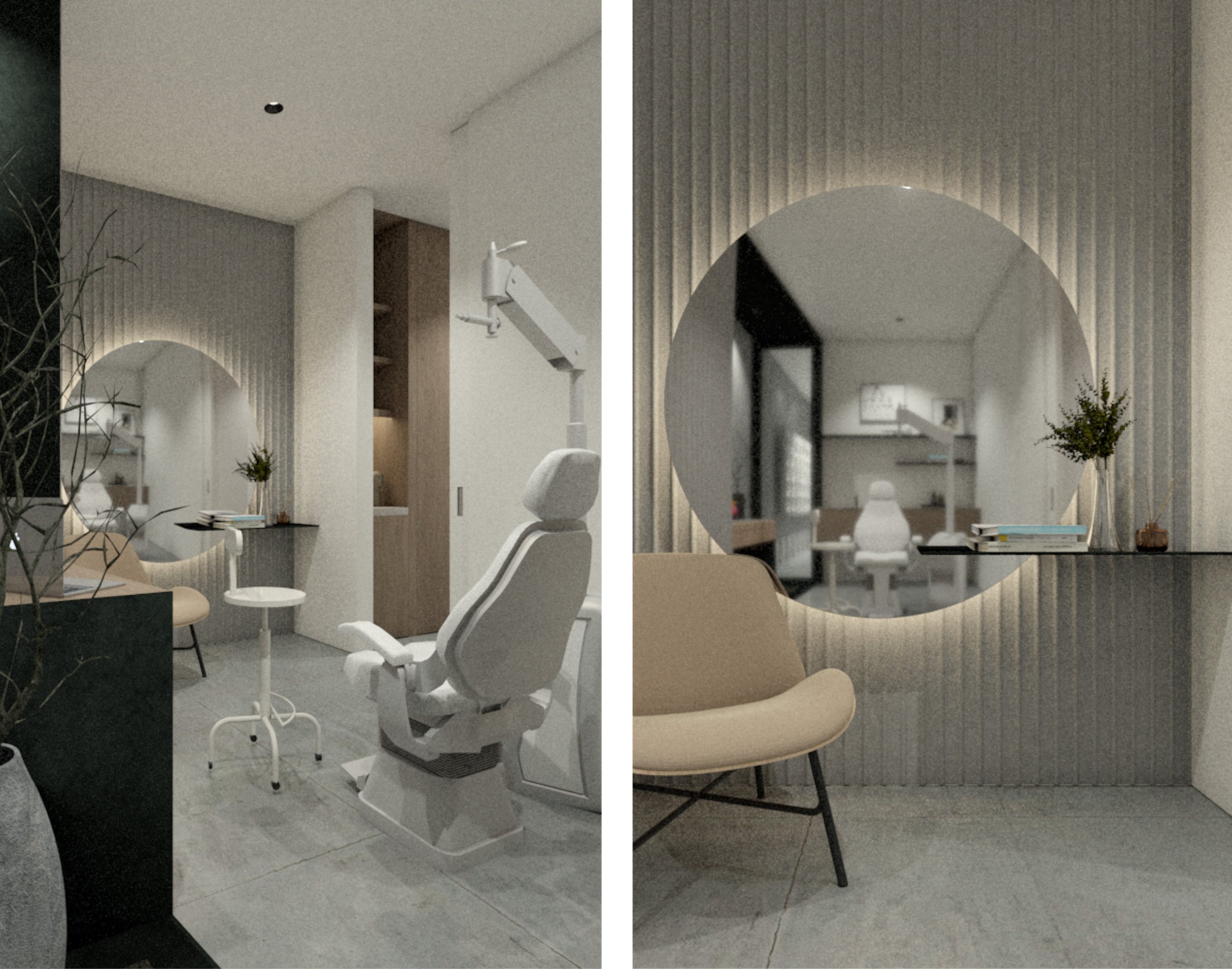
There is an unmistakable need for imageability, and you hold onto a memory of where you have been once you have left. What was the space like, what was the sensibility? The threads that tie SPAN together are all part of the same thought process – site specificity, novelty, and delight. We are interested in making spaces that count and provide an experience that you have not had before. It is not typical or generic or easily identifiable but it is desirable. You infer from the context who the players are and what is happening. The best spaces come from a higher aesthetic realm – and your retail stuff is more significant than other retail stuff. The wellness optical office and retail space, Line of Sight, makes this case.
“Line of Sight is a philosophy of what vision care can be. The inaugural physical manifestation of the brand, The Studio, is a calm and contemplative retreat from the constant bustle of city life.” Line of Sight
“Vision is the art of seeing what is invisible to others.”
- Jonathan Swift
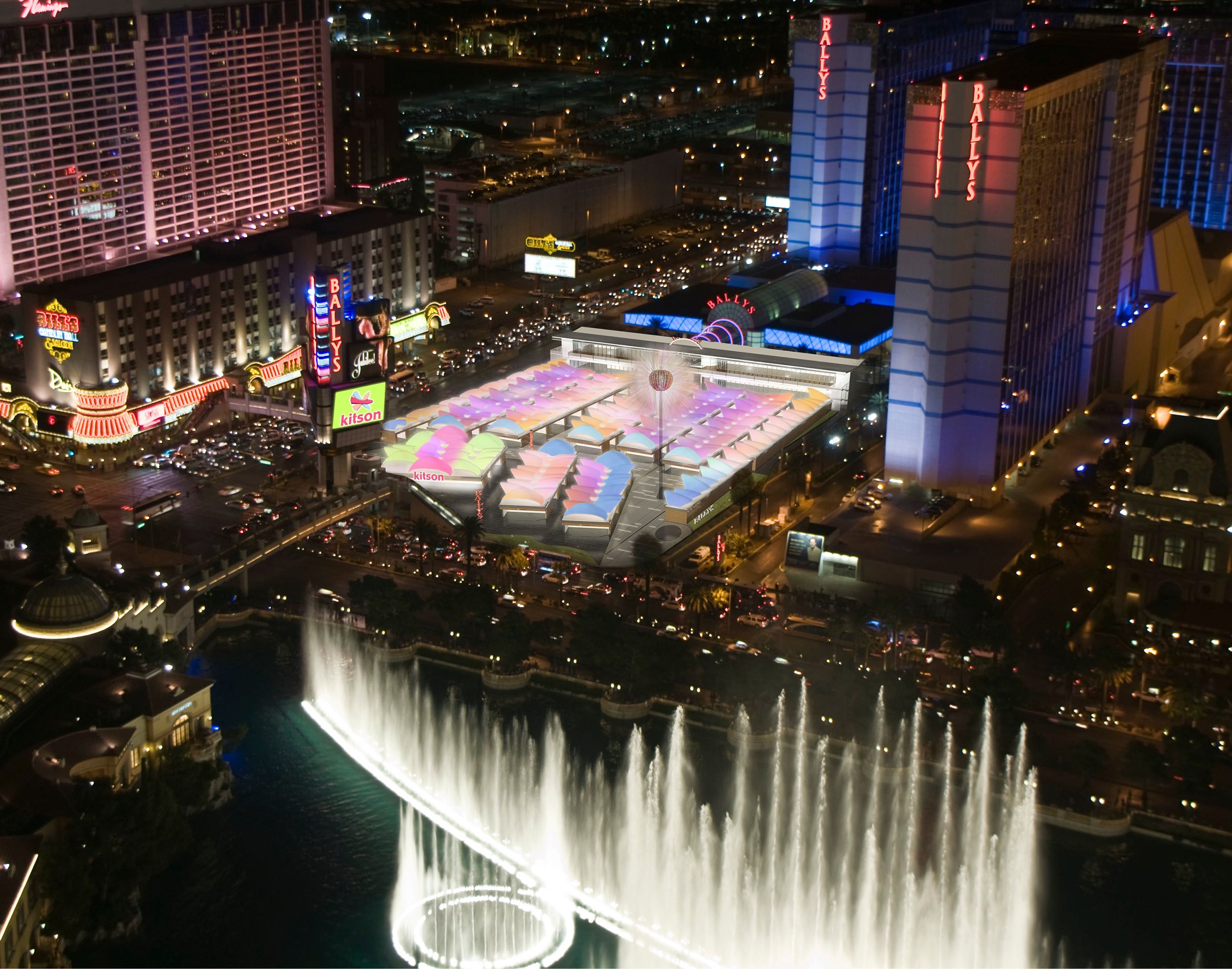
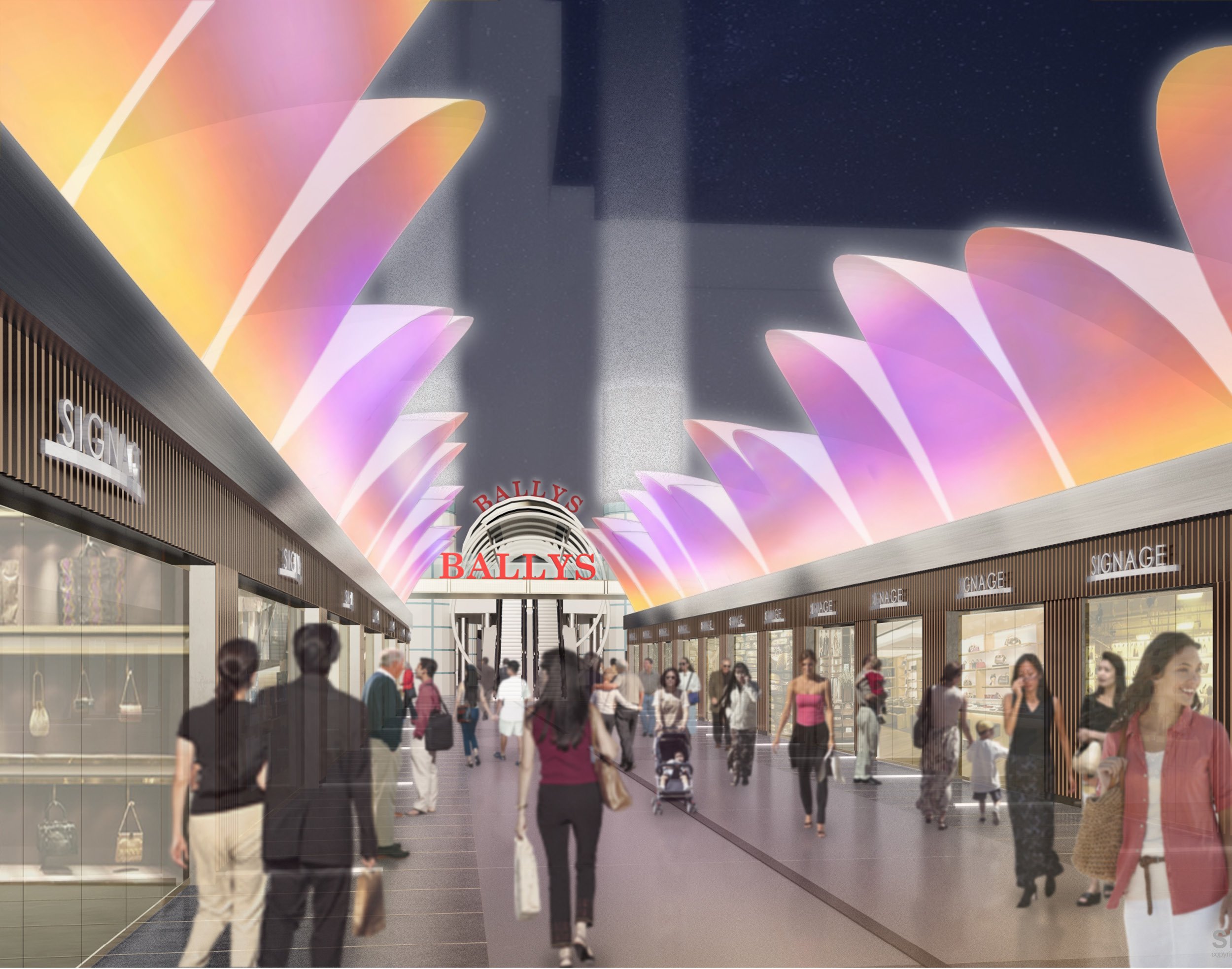
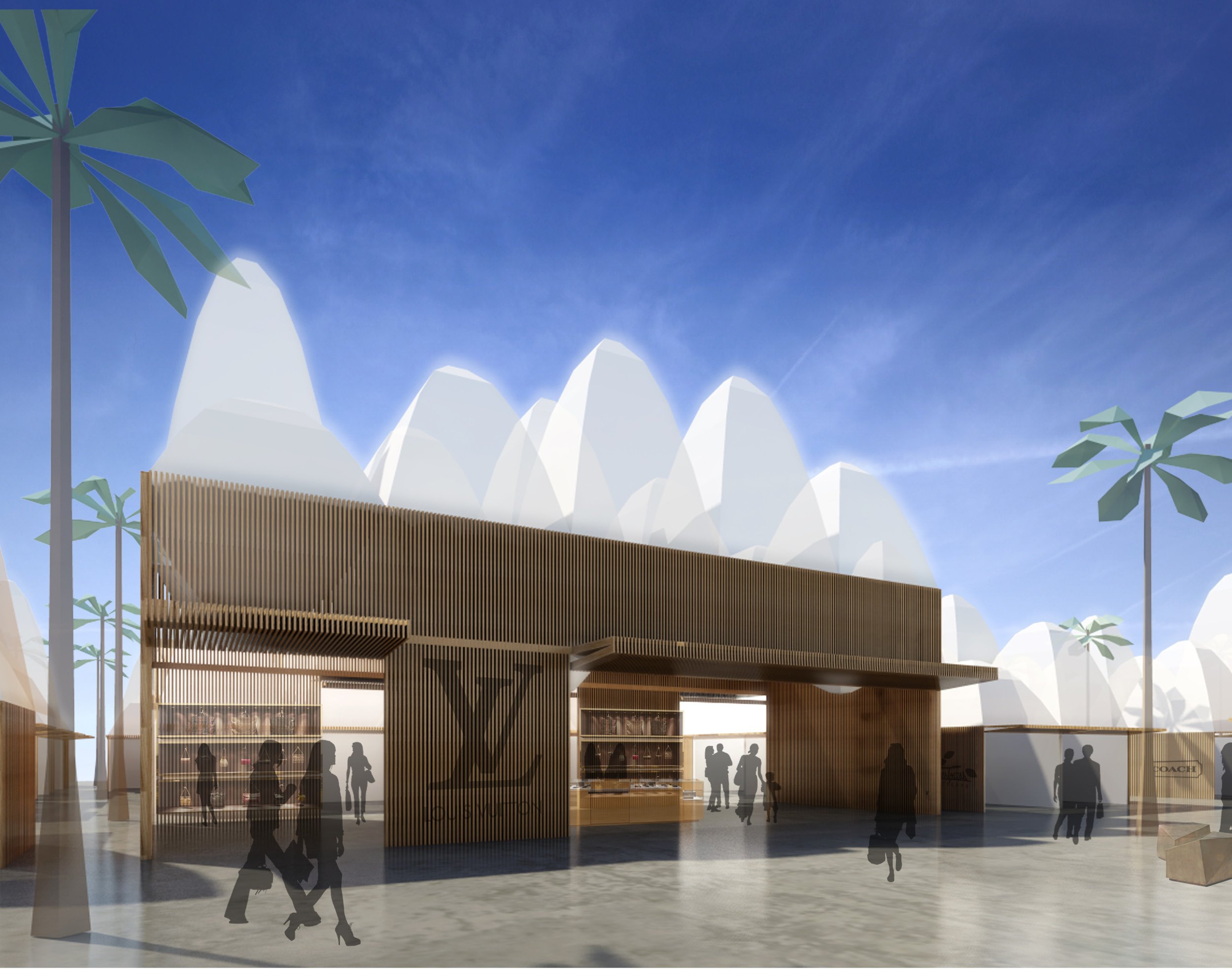
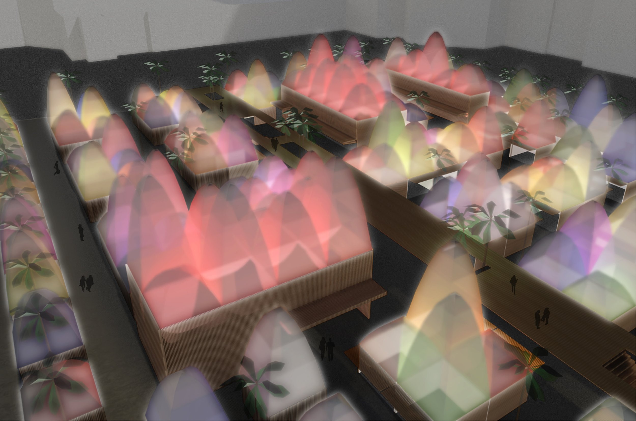
In contrast to the finite scale of eyewear or a tooth, Bally’s retail experience is not about one product, one shop, it is about curating every shop. Bally’s realized that 10,000 people walk up and down the sidewalks of the Las Vegas strip by their hotel every hour and turned this into a retail opportunity. They diverted the pedestrian traffic from the strip into Bally’s open acre of frontage, promising the opportunity for a new retail experience.
Las Vegas is spectacle. People like to see things that are different – above and beyond their typical experiences. So, we created a light show with the benefit of cooling off from the desert heat. Pop up tents aggregated retails into one larger phenomenal experience. ETFE “hats” use the dry desert air to create a convection loop.
We are interested in elevating the retail experience by making it a real experience. There is product to be sold however there is an experience to be had. The products are not everyday objects; they are coveted and speak to the way you live, to your story.
Credit:


